I worked with a business once that had an obsession with aesthetic design. Their business was in the cosmetic healthcare industry so maybe that's part of why they were so attached to aesthetics. Or maybe it was that their business design decisions tended to be heavily steered by the owner, and that kinda just was how the whole business would work. The way they thought merchandising a product should go was not to have a progressively optimised and well-tuned page full of individual components and parts that worked well and were received well by an audience. They were into gambling. They liked to design whole new pages where all the things on that page replaced all the previous things on that page.
It was an opinion-led business. Experimentation did help in the sense that at least they were actually able to understand when a page that was (in their opinion) better didn't make any more money or sell any more units, but it didn't change their core and unshakeable personal belief that they could look at a new design which was visually more stimulating than the previous one, met their individual aesthetic design preferences and therefore must be the key to new and limitless growth.
In the time we worked together, the pattern that emerged was that I would research real customer behaviour and how those customers shopped and what their concerns were and how we could give it to them. I would design, build and then launch experiments around that real need and real data and often those experiments would win. They'd conclude, fully powered and statistically significant, and they would make money. At the same time, various people in the business would pitch entire new page designs that replaced those winning changes, and we would build and test those (or they'd be sold a landing page build from a landing page building company) and they would be inconclusive or they would lose.
They were even on our systems to capture learning and to feed future iterations and future business decisions based on what we learned. We could tell you, for example, that our customers valued the outcome more than they valued the product. Every time we talked about what people's lives were like after using the product it seemed to work. Every time we talked specifically about the product and the process of using it, it seemed to not work.
I can also tell you that acknowledging explicitly why people were looking to buy the product seemed to work well. People responded positively to us acknowledging the suffering they had, and the hope they had for fixing it.
I can tell you that they didn't really care about the price. They had the expectation it wasn't cheap and no wangling costs or adding in offers worked to bring in additional business. Those things just ate away at your margins instead or worse, they gave people reasons to doubt what you were selling.
This learning was captured and shared with the business in the hope we could help it get maximum value from its experimentation and CRO programme. Some of it took and some of those people learned, but fundamentally it remained an aesthetic-first business and now we are no longer working together I can see that they are still pumping out new designs regularly without any real plan or reasoning behind it. It's likely they always will.
Now, other businesses may not be that chaotic, but that process is how many redesigns actually happen. Somebody points at the one they like best and that design then is built and ships. Along the way, a load of decisions are explicitly made by individuals on behalf of the customer. Decisions like "Here's what we'll show and not show". If your designer or your developer thinks you don't have a particularly compelling delivery or returns offer, they might decide to make that information harder to find. Or entirely absent. If your marketing manager thinks the mailing list is looking a little weak, they might instruct the designer to change the copy underneath the new checkout to say "Check this box if you do not want us to keep you informed with new offers".

Every single one of these decisions is one that could probably be rationalised by the person who made it. They would sound reasonable for making it, and it would draw on personal experience, taste and maybe even broad interpretations of customer insight. It would also, if it hasn't been tested in a controlled way with real users, be potentially wrong. Or potentially right. Or make no difference at all. You simply won't be able to tell.
This is the second piece in a series where I talk about the individual job roles that a good CRO practitioner does and we have a little fun with the Final Fantasy job system while we're at it. The researcher was our first job. This is the web designer/artist and I'm going to spend a bit of it being rude about redesigns.
You have been in this meeting
Some new designs go up on the big screen or in the video call and everybody has an opinion because everybody has eyes and personal taste. The opinions get settled by whoever is most senior or who can be bothered to fight or by dusting off the brand and style guidelines that were also drafted entirely based on aesthetics and vibes but 18 months ago and then it is somebody's job to build the design that achieved consensus in a small room.
What customers did/do on the old page doesn't really come up because nobody brought that with them and also because that is OLD and we're not interested in talking about things that are OLD. This is where we talk about things that are NEW, and remember NEW is better.
And maybe you are the person who signed it off and the new page or site has been live for a few months, and it is beautiful only you can't prove that it is selling more or less than the old one did. We spent a lot of time and a good chunk of money to travel nowhere. Other stuff has happened. Google Ads are more expensive now. We've scaled down Meta, scaled up Tiktok. We've changed agencies. One of your competitors has gone under, or they've had some TV ads. The world is different and the way the business performs today could be one, all, none or some of those factors.
In a previous role we were brought in to work at a business that was 3/4 of a way through a redesign of their website. There was a big redesign, replatform and relaunch planned and it was soaking up lots of the effort and energy within the business. I think, looking back on it, what they probably wanted was our opinions on what would convert. All the design had basically been settled though, so ironically even if we WERE possessed of the second sight and had the ability to just see what would and wouldn't work, we probably couldn't have made any changes beyond copy. Had we been brought in before the redesign started, we'd have been able to build out smart hypotheses and test them and then we'd have ended up with some tested and validated concepts that could have gone to design and build. What we did end up doing was helping them manage a progressive rollout that would be able to measure the differences between old and new design.
The test ran for 8 weeks and was inconclusive when stopped. At this point they'd already spent all the money on the project though, so the test result was not well received. There really was no other way it could have gone though because the story the business told itself was that a redesign was the path to growth. That just turned out not to be true.
What DID work though, was the experimentation programme that ran AFTER the redesign, where we were able to selectively find, fix, tune and replace components, copy, features and functionality to deliver a site that really performed. Ironically what they spent on the CRO programme was a fraction, a rounding error compared to the cost of the redesign. Yet it's clear which one drove the sales.
In 1995 two researchers at Hitachi's Design Center, Masaaki Kurosu and Kaori Kashimura, put 26 versions of a cash machine screen in front of 252 people and asked them to rate each one for looks and ease of use. How good a layout looked had much more to do with how easy people said it was than with how easy it was. Nielsen Norman Group call this the "aesthetic-usability" effect and their write-up documents a usability session where a participant struggles her way around FitBit's website but then rates it "very highly" for ease of use. The only things she mentions are the colours and the photographs. It "looks like the ocean".
A design review is a room of people looking at a picture of a page and reporting how nice it is. Then that room conflates "nice" with "effective". I had a similar anecdote around preferences in the researcher piece where a paint retailer's customers LOVED the vibrant colours but they then bought cream, beige and grey.
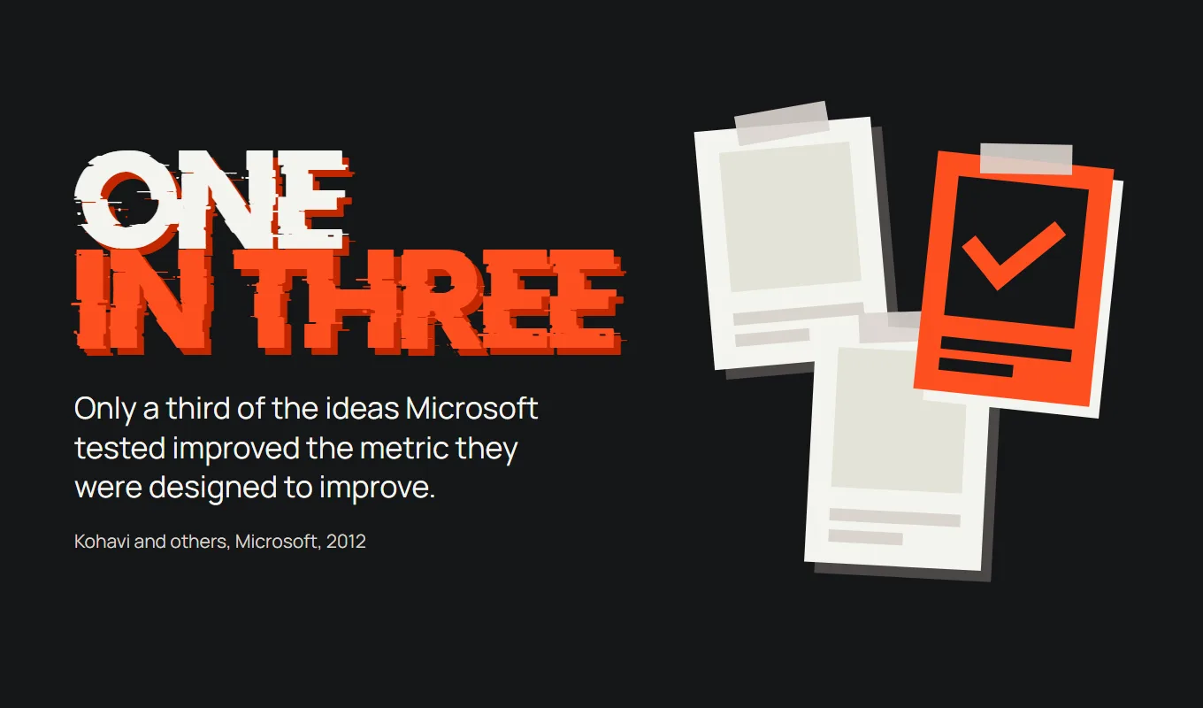
Before you conclude that the fix is better people in the room and that being unable to determine effectiveness from a visual examination is an individual failing, here's a statement from Ron Kohavi's team at Microsoft. They wrote in 2012 that only one third of ideas tested at Microsoft improved the metric they were designed to improve and even those were the ideas that the teams believed in enough to build. The same paper claims that their job is to tell clients that "their new baby is ugly".
Joe Whiteman, PPC manager at Smile White and Yorkshire Dental Suite, said much the same about me earlier this year, only kinder. "He isn't afraid to challenge a landing page you're convinced is the bees knees." Thanks Joe.
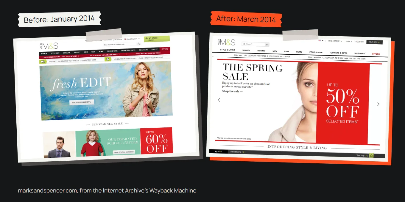
When a redesign is big enough the result actually ends up as a matter of public record. Marks & Spencer spent three years and £150 million on a new website. They launched it in February 2014 and in the first full quarter afterwards M&S.com sales fell 8.1%. Chief executive Marc Bolland's line was that "the settling in of the new M&S.com site has had an impact on sales". Now I'll be fair on this one and say that it could be more than just a new design. At the time they were also moving off a platform Amazon had run for them for seven years and they forced every customer to register again (only 3.2 million had by that July, against the six million M&S expected eventually). Bolland claimed that they were running fewer promotions too. That does sort of prove my point though. Your relaunch changes a hundred things at once for ALL of your traffic. It's a remarkably dangerous way to launch anything because you'll never be able to adequately separate out each of the effects afterwards.
So what is the designer for?
A lot of businesses tend to treat designers as picture-drawers and asset factories. An executive has an idea already in their head and the designer’s job is simply to get it onto a screen. And then the business has a queue of banners, landing pages and social tiles it wants too. This wastes the thing that good designers are best at.
The best designers are problem-solvers. Give them a real problem and they will find smart, elegant ways to solve it. But they can only solve the problem they have been given and they have to understand it intimately. Who is showing up, what are they trying to do, and what is stopping or discouraging them?
If you want to make more money then the problem is “why aren’t people buying?”. That is a hard, real and specific question with answers that you can go and find. Most businesses instead don't start with that question at all, they start halfway through a proposed solution or they brief that “the site could do with a refresh” instead. So the solution that gets designed is to please a handful of people, sometimes even one person and your customers are afterthoughts.
So the designer does what they were asked and the site comes back looking newer, slicker, sexier. The sort of thing you might see Apple release. Oh yes very clean. Oh I like that feature, it's really slick. Your customers show up after launch and if you have managed to solve their problems or answer their concerns then it's only by sheer luck, because they never got anywhere near the brief!
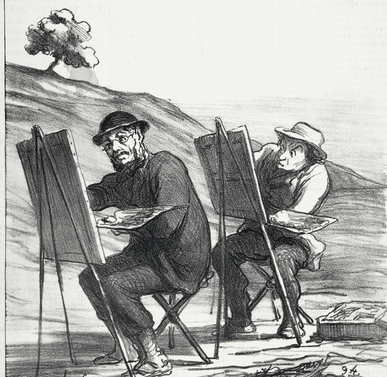
To get the best out of this job you need to hand a designer a real problem, deeply understood.

Jon Crowder runs Another Web Is Possible.
Sources
- The Aesthetic-Usability Effect, Kate Moran, Nielsen Norman Group, 3 February 2024
- Trustworthy Online Controlled Experiments: Five Puzzling Outcomes Explained, Ron Kohavi, Alex Deng, Brian Frasca, Roger Longbotham, Toby Walker and Ya Xu, KDD 2012, August 2012
- M&S blames new website for quarterly sales fall, RTÉ, 8 July 2014
- UK Retailer Marks & Spencer's Revenue Results Smacked by Website Woes, Robert N. Charette, IEEE Spectrum, 14 July 2014